


July 22 | By Asheesh-Bhardwaj | In Web Design
Every site technically has a landing page, but why do only a few rise above the rest?

If you pick any 5 successful websites and try and figure out why they’re thriving, a great landing page is sure to be one of the main reasons .
Every site technically has a landing page, but why do only a few rise above the rest? What makes them better? When your landing page isn’t good enough, the bounce rates shoot up, conversion rates dip, and you’re left with a wilting business plan.
This could happen to anyone. Too many good businesses miss out on the traffic and response they want because they didn’t put enough thought into a good landing page. But you don’t need to make these mistakes
What is a landing page, really?
Simply put, a landing page is the first thing a visitor sees when on your site.
Going by that definition, every single page on your website can be considered a landing page depending upon how visitors get there. So, if a customer searches for the keyword “Contact” along with the name of your business, your ‘Contact Us’ page becomes the landing page for that customer.
A landing page could ask for your participation from filling in a form, downloading an eBook, to taking a survey or buying something from a site.
Now, landing pages can be broadly classified further:
- Clickthrough: The very basic kind of landing pages, click throughs, typically contain general information related to the product or service you are offering along with a button guiding consumers to the ‘Place Your Order’ page, where they can make the purchase.
- Lead Capture: As the name suggests, lead capture pages collect personal data like name, age, email, etc. from visitors. This data is then used to send out email marketing campaigns, approach prospects with special offers, and connect with them.
- Infomercial: The online world has its equivalent too.These landing pages feature similar commercials and involve a lot of scrolling.
- Viral landing pages: Viral landing pages generate brand awareness and create buzz among the target audience. Such pages feature creative content, infographics, photos, funny videos and/or flash games among other things. Viral pages are different from other landing pages because they are shareable and typically feature social networking buttons.
- Microsites: A microsite is a minisite used for large campaigns. They come with their own vanity URL and aren’t necessarily single page sites. Customers are directed to it from online, print, or television ads.
- Product detail pages: Probably the most common type of landing page, product detail pages are a part of the main website. They contain information related to the product or service a visitor has clicked on- but tracking your campaign’s success or failure can be quite difficult with them.
- Homepages: Having the homepage as your landing page is not particularly effective. In fact, they have the least conversion rate among all landing pages. This usually comes as a shock to people, so if you’re surprised, you don’t have to feel alone.
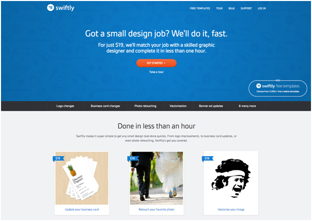
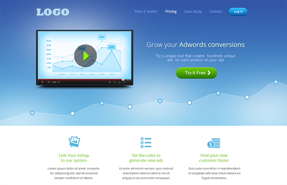
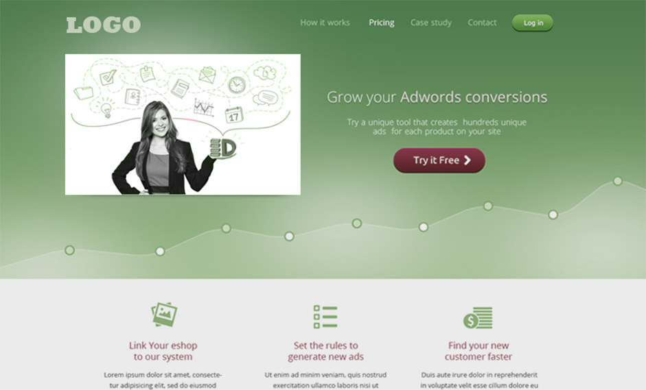
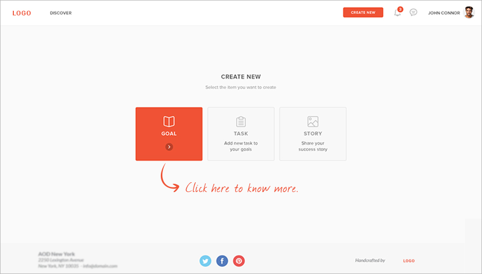
Anatomy of a great landing page.
Let’s look at the same landing page example mentioned above and talk about what makes them so successful.
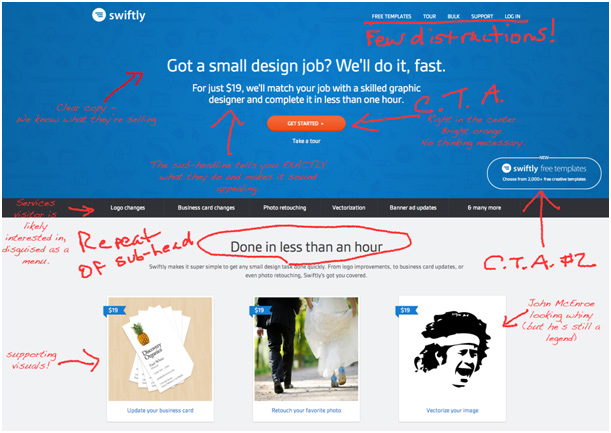
A great landing page has 4 essential features:
- A great headline that talks to the potential buyers, intrigues them by giving them a rough idea of what you do and how you can benefit them.
- A great sub-headline (optional, but helpful) that illustrates exactly what you do and makes you sound capable and important.
- Obvious call to action. It needs to stand out and yet be a part of the overall conversation. Behave as though it were saying: “Sounds good? Let’s get started then!” Oh, and feature just one CTA prominently. Too many, and your message can get muddled.
- Supporting visuals. This can be a video too. Show them what it would be like to use your product and remove the guesswork.
The strongest benefit comes when a CTA is posted where an interested prospect will bump into it.
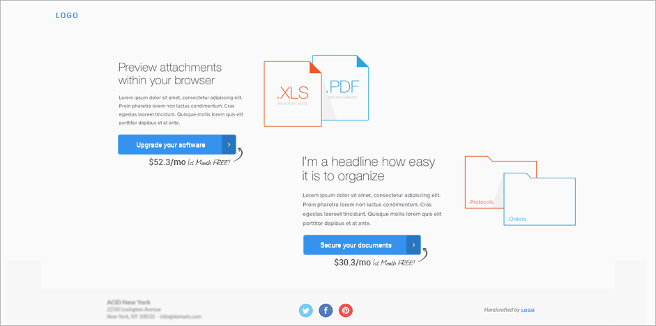
So this page includes…
- Relevant logo and branding
- A concise and clear description of the product
- The price in sub-heading
- A repeat of the sub-heading/most important value proposition
- A list of services
- Images of the products in action
What would make this landing page even better? Keep reading…
Sales Boosters
It is always a good thing to be able to talk with concrete proof… things that make prospects feel a little more trusting of the brand they just met.
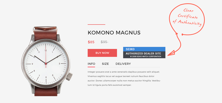
Certificate of Authenticity
A major concern for ecommerce websites is assuring consumers of the authenticity of the product they offer. The ‘Seiko Authorized Dealer Site’ boosted their conversion rate by 107% and effectively doubled Express Watches’ sales figures. Interestingly, there was a ‘Never Beaten on Price’ badge on their site, to reinforce the low price guarantee offered by Express Watches. It seems like customers place a higher premium on authenticity than price when buying from new vendors.
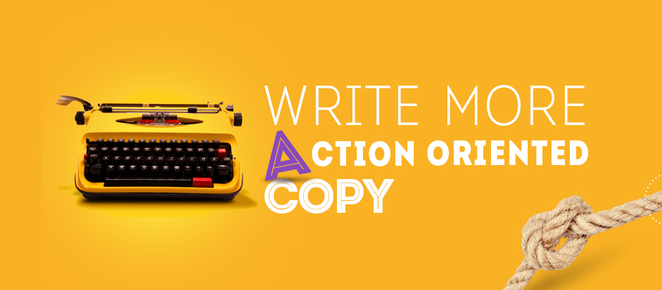
Action oriented copy
L’Axelle sells underarm sweat pads. Gross, perhaps…but it takes care of a very real concern for many people. On their original landing page, the content was comfort oriented. With phrases like “Feel fresh without sweat marks’, ‘Maximum freedom of arm movement’, and ‘High wearing comfort’, buyers were made to feel relieved and relaxed.
When it was changed to more action oriented copy, like “Put an end to sweat marks”, customers felt like they were being offered a solution. A small tweak like that boosted their conversion rate by 93%!
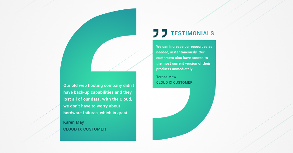
Testimonials: All day, every day.
Talk about small things being important, testimonials exemplify that really well.
Example? WikiJob, a U.K.based job site, moved the three testimonials they had from near the bottom of the page and brought it a little closer to the top. And their conversion rates went up by 34%. The power of testimonials can’t be ignored.
The Most Important Elements of a Landing Page.
The best way to master landing pages is to break them into smaller sections and study each one in more detail. So let’s get started…
Headline/Copy
As with every conversation, what you say determines what you get out of it. A well written landing page goes a step beyond language and creates an instant connection with visitors (which is pretty much the whole point of having a landing page).
How do you write a great headline?
The most important thing to keep in mind while drafting the headline is that, in most cases, the viewers may have little or no idea about you. The headline has to introduce you to your prospects, and it has to do it well.
There are 3 common approaches to writing the headlines for landing pages:
- Ask a question: “Is a slow printer affecting your productivity?”
- Talk up the benefits: “Our printers save you a week’s work.”
- Solve a problem: “No more waiting. Just press print and it prints!”
Regardless of the approach you take, there are some key elements that you need to keep in mind while drafting a landing page’s headline:
- Establish what you can do for them. Clearly define the purpose of your product in the headline, don’t wait to do it somewhere else that they may never see. .
- Use testimonials in your headlines.
As an example, take headline A “PrintersUSA can help make your business faster”. Ordinary, right?
Now consider this headline— “I’ve been using PrintersUSA for years. The transition was easy and we don’t waste time staring at the printer anymore!” This one inspires more confidence, no?
If someone thinks your products or services are great, it’s automatically going to make prospective customers trust you more and shape a positive image about what you are offering.
- No matter how tempted you are, don’t try to say too much in the headline. Don’t keep it too short, or too long. It has to be just right!
- Using technical jargon, giving out the prices (unless that’s your selling proposition), stuffing it with sales keywords… these are a big no-no.
Here’s how you make sure you’re writing good copy:
A. Speak like, and to the Customer.
Always speak to the customers in their language, without showing off your expertise in any way. Landing pages are comparatively short, to the point, and action oriented. The risk of losing your prospect’s interest is extremely high. Maintain a tone that is easy for your customers to grasp. Use common language. Maintain a casual tone despite coming across as an expert.
B. Be clear.
Figure out exactly what you want to convey on your landing page, and don’t deviate from the message. Boil every word on the page down to its essentials. If you’re not clear, your visitors won’t give you another chance to explain or hunt down the answers. You’ve already proven that you’re not worth the effort. Keep your language simple, your offer straightforward, and the benefits apparent and easy to digest.
C. Talk ONLY about things the customer wants to hear about.
I hate to burst any bubbles but no one cares about your brand… (yet, at least). Your business will only be loved if it does something special for its customers.
There’s very little to be gained from telling your customers something like: “We started this company 10 years back from a garage and today we are located at the heart of the Silicon Valley). A better angle would be “We bring with us the wealth of 10 years of engineering experience and expertise”.
Strictly talk about the benefits your customers will get out of it. Keep it about them, show that you are here to serve them before anything else, and they will happily trust you with their money.
D. Inspire action
You need to sprinkle trigger points throughout the copy to push visitors to click that ‘Sign Up’ button. Do not confuse these with call to actions. Create a sense of urgency that prompts readers to take the plunge.
Examples
How about these?
- https://basecamp.com/start
- http://do.thelandingpagecourse.com/
- http://blog.kissmetrics.com/landingpagedesign/
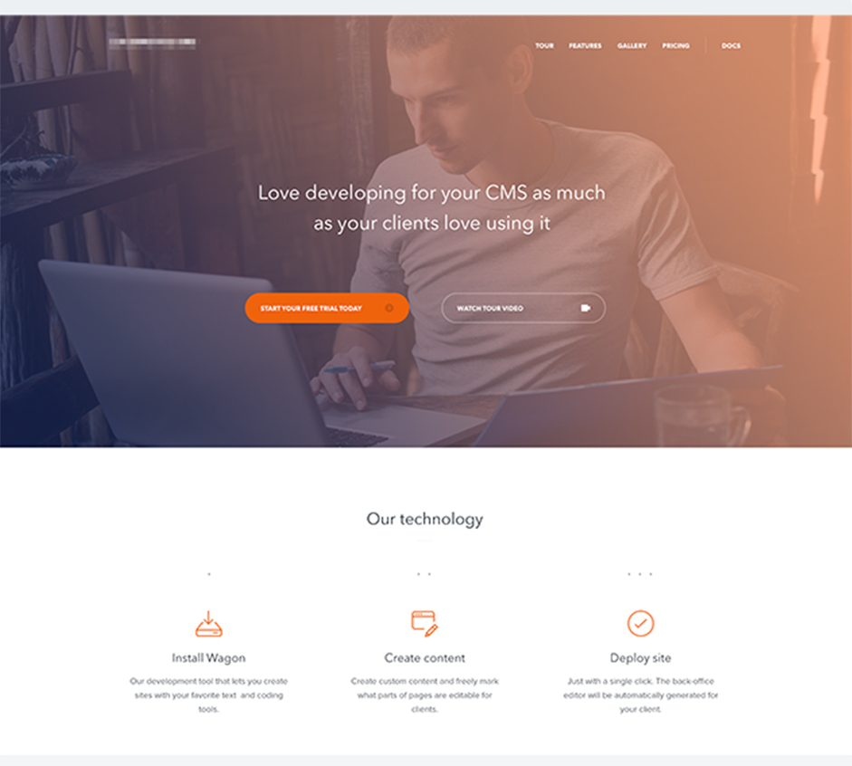
Video/Image
The trends in landing pages have changed. Video based landing pages have caught on big time in recent years. Many businesses have been experimenting with different styles of videos in landing pages with good results.
The popularity of video embedding in landing pages has also triggered its fair share of debates and tests to analyze its effectiveness as compared to image based pages. The results are not as clear cut as you might think.
Benefits of video based landing pages
Videos are more dynamic, involving, and stimulating in nature.
Videos are convenient. Users can watch and absorb your message instead of having to read through it.
More personal. People tend to buy from other people, and a video of a person who has used a product goes a long way in winning the viewer’s confidence. Instead of a mass of words on a webpage, what you get is a real, live person talking to you.
You get to show your product in action! Many products are best described through a demo. A 10 second video can achieve what a full page description cannot.
Testimonials. Testimonials in themselves are a great way to make prospective clients trust you. When you have real people telling your prospects how great your product was or how reliable the service is, it can make a bigger impact than some words on a webpage.
BUT…Image based pages still work
Before you run out and spend your landing page budget on producing a fancy schmancy video, you should know that image based pages still work well. It’s sometimes better to start with these first and test a video later.
There are enough split test results to prove that not only can image based landing pages stand their ground, but in some cases, they can also outperform their video rivals.
The reasons why an image might work better than a video can be psychological (like people perceiving video as more of a distraction), or functional (like videos not buffering on slow internet connections).
If you choose to stick to the traditional medium of images, you must pay attention to the kind of image being used. When I say ‘kind of images’, I mean: what does the image depict to your visitor? The rule of thumb is that the image should represent your customers instead of representing you.
Better yet, represent the person your customer wants to become.
Examples.
Call-to-action.

As the name suggests, calls-to-actions (CTA) are the media that allow people to take a step in response to your pitch. Call-to-actions are applicable to all forms of marketing communications like emailers, sales presentations, newsletters, etc. However, they are more relevant to landing pages because a landing page’s main purpose is to earn an action from the visitors.
An inquiry form, newsletter subscription box, an opt in form are all examples of call-to-actions. They vary in nature and purpose, but abide by similar guidelines.
Here are some DOs for good call to actions:
Again, have a clear purpose.
You need to have utmost clarity about the purpose of your CTA. The purpose largely defines the approach that you take in terms of styling and placement of your call to action.
If your objective is only to give people a teaser about your services then you might as well have the call to action within the center screen as it will just be a text field for name and email ids.
On the other hand, if you are looking to have a ‘Shop now’ kind of CTA, then it needs to be towards the end of the sales pitch and has to be placed in a comparatively subtle manner.
So what you want to achieve will define how you go about achieving it.
Make it easy.
Staying in sync with the clarity of its purpose, a call to action must also be methodically laid out. It should flow as intuitively as possible for the users.
The conventional layout of a CTA is…
- Title
- Sub-title
- Input fields
- Submission prompt
- Sign-off
Feel free to play around with this structure but not at the expense of ease of use. It should be different, but not confusing. It’s also a good practice to make subtle tweaks in your landing page’s CTA and keep testing for increase or decrease in results, and subsequently make the necessary changes.
Stand out
The most important thing on the page deserves to be in the center.. However, putting the CTA at the forefront of your landing page can be quite tricky, if not lethal. Highlighting the call to action is important to you, but what’s more important for visitors is the message, the service, the “what’s in it for me?”
Your aim is to draw your prospect’s attention to it, but the CTA shouldn’t be so in-your-face that it puts them off. At the same time, it can’t be underplayed to such an extent that your visitors end up ignoring it altogether. That would defeat the whole purpose of having a CTA.
Give CTAs the due attention they need by placing them in a clearly defined distraction free area and using color highlights, contrasting backgrounds, pointers etc. to make them more prominent. At the same time, avoid making it the only visible thing on your page. Landing Pages bring a world of tricky balances, but you can and should test to find the best one.
Examples
Design / UX
Last, but definitely not least, are the design elements of a landing page. Its structure (or layout) is what separates a good landing page from a great one.
A landing page is primarily comprised of the following:
Header: The header is the topmost section of your page and the first thing that a visitor sees. The presentation of the header should always be in sync with the ad campaign that led prospects to this page in the first place. This helps maintain uniformity in the users’ minds. It also needs to be the most appealing and catchy section of the page. Refrain from having half a dozen menu options in there. You want your prospects to make a decision, not get distracted.
Body: This is where all your copy goes. The length of this section depends on how much you want to say, but other sections around it should balance it out so that the page looks uniform. The most important thing to keep in mind is that people generally skim through landing pages. Therefore, you should separate the copy with color highlights, bold headlines etc., especially if the copy is long.
Conversion: On landing pages, conversions come from forms or from call to action buttons. These obviously are the sections that you would give most attention to, but be careful not to overdo the attention getting stuff, like highlighting or having disproportionately huge fonts.
The placement of call to actions is a strategic decision in itself. A simple shift from left to right can make a big difference. The best way is to conduct split testing and pick whichever works best.
Social Proof: Most people don’t understand the power of testimonials. These are not extra fluff items to be pushed around your page where there’s space. These. Get. Conversions.
After you’ve established the structure of your landing page, you move to the actual designing of all the sections.
Stuff to consider:
- A navigation bar is not necessary. Unlike websites, landing pages don’t need a full-fledged navigation. At best, a link to the main website homepage is all that’s needed. In fact, some landing pages do away with that too, reducing any chances of prospects navigating away from it. After all, isn’t the whole point of the landing page to move your visitor into action?
- Cut the fluff. Incorporate the above-mentioned sections and don’t bother about adding anything else. Sleek works best with landing pages… always!
- Formatting shows professionalism. Proper headlines, consistent font size, relevant underlines and bolds, they all add up to bring a professional feel to the page.
- Use contrasting colors wisely. Steer clear of jarring colors, but don’t make the page too vanilla either. Use contrast and highlighting to separate sections.
Can you tell a good landing page from a bad one?
That is the most important question, isn’t it? How do you tell a great landing page from a not so impressive one? It’s not always easy when you start off and all landing pages look pretty much the same.
Soon enough, you’ll be pointing out things like, “Hey, that headline could have been more actionable” or “That Call to action button should have been displayed more prominently” or “This landing page could use some social proof.”
Let’s look at a few landing pages.
American Bullion
Status: Hit
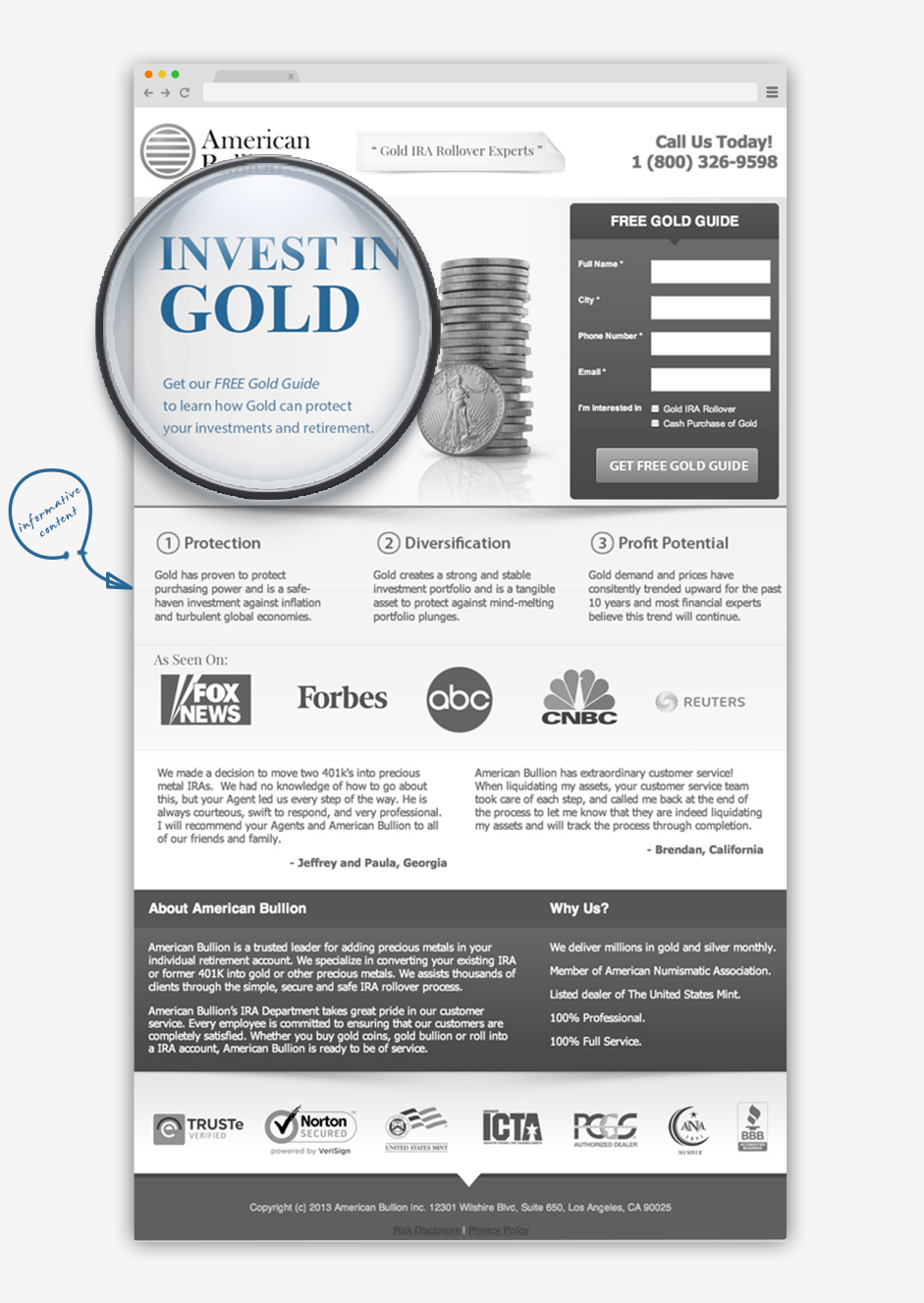
This is a great landing page. The headline is short and to the point, while the intro paragraph gets right into what you will get after filling up the form. While most of the information you need is above the fold, there is plenty of social proofing below it as well, in the form of media mentions, testimonials and trust symbols.
Sweet IQ
Status: Hit
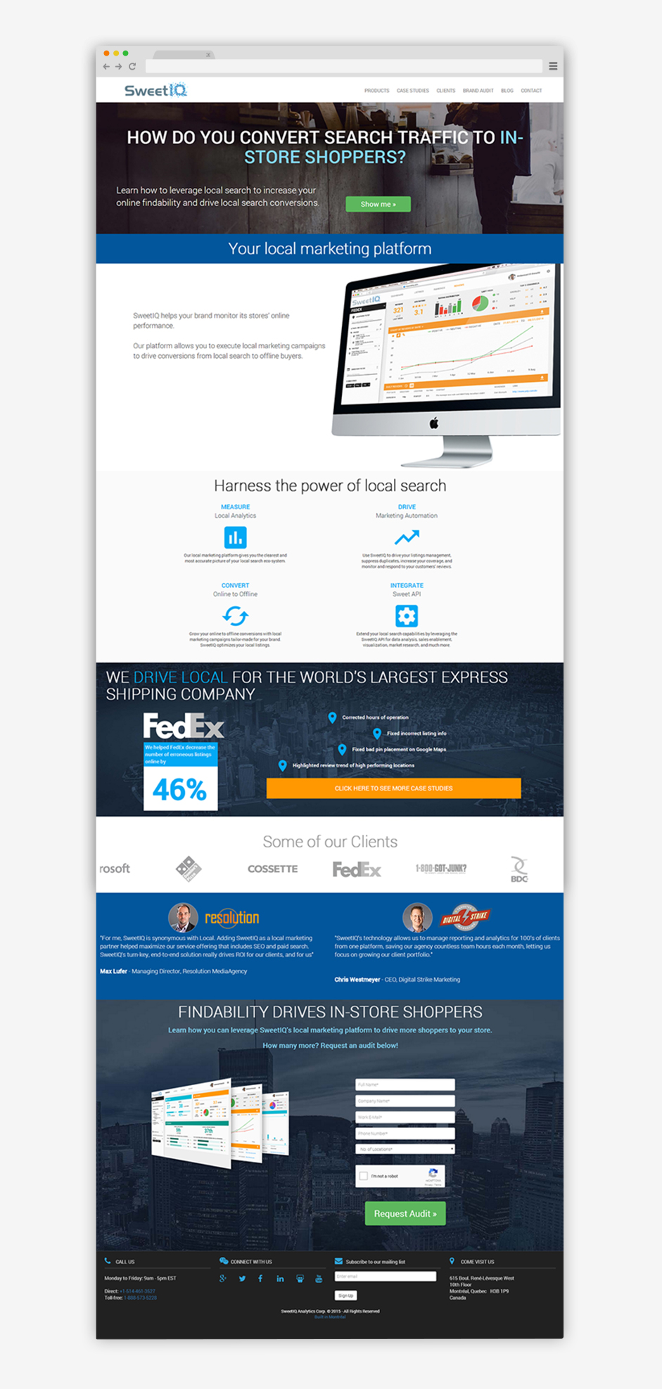
You may be a bit surprised to see this landing page featured here. “What’s so great about this?” you’re probably going to think. Well, I’ll tell you. Although not a fancy landing page, this is an example of a minimalistic, yet a highly functional one. SweetIQ passes the “Blink test” and in just one glance, you can tell what this landing page is all about.
The “Great For” section on the right is especially nice since it immediately gives consumers that identify with those sections an incentive to fill up their form.

By Asheesh Bhardwaj
Asheesh Bhardwaj is a subject matter expert, and the Director UI/UX of IX web hosting. His interests include kickass designs, entrepreneurial ventures, and beer.
Leave a Reply