Are you a cutting-edge brand or a traditional one? Are you at the forefront of new discoveries, or are you bringing back a little of the “good ol’ days”? The branding trends for 2019 divert into two definitive and opposing paths, futuristic and nostalgic, and consumers use these trends as signals to determine which side your company falls into.
That’s not to say one side is better or more profitable than the other. How you present yourself depends on what you offer and who your target audience is, and in some cases you can even combine both styles for a unique brand identity. Our point is that, in order to effectively use the branding trends of 2019, you have to first understand what they are and how they affect you.
So, after analyzing design trends for logos, product packaging, web design, typography and graphic design in general, we compiled a list of the ten best branding trends for 2019. Use these trends to keep your company branding up to date in the new year, whether you’re looking ahead to the future or back into the past.
1. Shapeshifting logos: contextual, variable and responsive
2. Eye-catching serifs
3. Friendlier geometrics
4. Vintage-inspired logos and packaging
5. Intricate details
6. Pixel art
7. Ghost letters
8. 3D imagery
9. Proactive negative space
10. Neo-minimalism
1. Shapeshifting logos: contextual, variable and responsive
—
First and foremost, let’s start with the biggest branding trend of 2019 because it affects everyone, regardless of company identity. Thanks to technological advances, more and more marketers are abandoning the outdated “never change your logo” principal, paving the way for more optimized, shapeshifting logos.
The idea is that a brand should have a few different logo versions in their stable so they can optimize their choice for each application. Logo for your mobile app? Use the small and simple version. Mass-printing promotional t-shirts? A black-and-white logo could save you money. Running a campaign for kids? A colorful and cartoony version of your logo would be more appealing.
If this is a new concept for you, keep in mind these three areas for logo adaptability:
- Responsive—on digital platforms, your logo changes to accommodate the size of the screen (i.e., desktop, tablet, smartphone, etc.)
- Contextual—your logo changes depending on where it’s used (i.e., a one-tone logo to be embossed on business cards, a custom logo to fit a baseball cap, etc.)
- Variable—certain parts of your logo change to suit marketing campaigns (i.e., using different imagery to appeal to different groups or promote different products/services, etc.)
The underlying trend, though, is that you can change your logo depending on your needs. You don’t have to go overboard, either—usually around four versions will suit most instances.
2. Eye-catching serifs
—
For years, minimalism has dominated digital design not just for its aesthetics, but also because of its practical benefits: minimalistic designs are faster to load and look better on smaller screens. (See #10 for more on minimalism). But lately we’re starting to see some backlash to minimalism, including the recent serif trend.
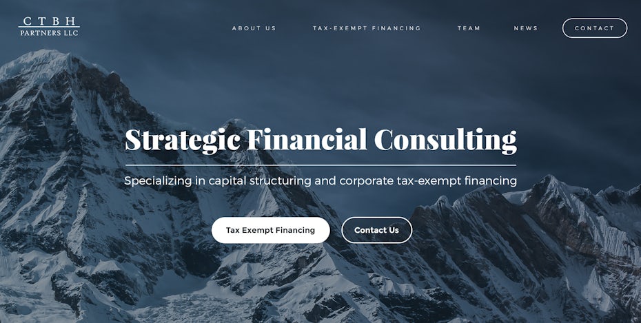
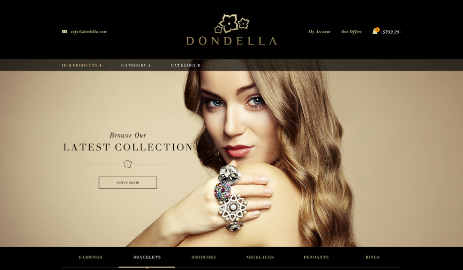
Serifs—those little tags at the end of letter strokes—have been a big “no-no” for modern, minimalist branding in the past. But they’re making a comeback in 2019, perhaps because of a return of old-fashioned styles, but mainly due to their unique ability to communicate a brand’s personality. In 2019 expect to see unique, custom-made, eye-catching serifs, with lots of character that take a brand’s style to the next level. This year’s serifs are strong and individualized, giving this branding trend a simultaneously modern and classic feel.
Whatever the case, serifs are best used sparingly: they work particularly well in titles, logos or headings, but aren’t a great choice for large blocks of text. Serifs can help your brand name or slogan look more distinguished, but they’ll make your blog article or site copy look busy and distracting.

Web page design by Mike Barnes

Web page design by Sandra Eftimie
3. Friendlier geometrics
—
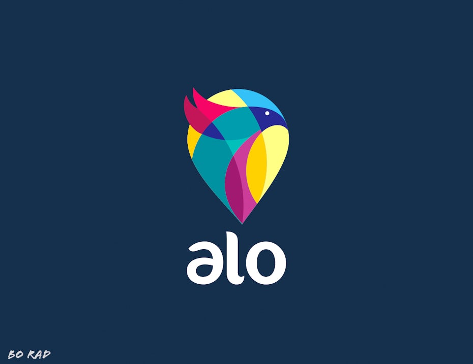
Let’s talk about one of the more futuristic trends in branding: geometrics. Geometric branding involves grids, straight lines, and abstract modern shapes. This style appeals to people’s desire for structure and order, as well as their current fascination with cutting-edge modernism. But geometry alone comes with an innate drawback: such mathematical designs come across as cold, intimidating and at times oppressive. The solution: an evolution of geometry in branding.
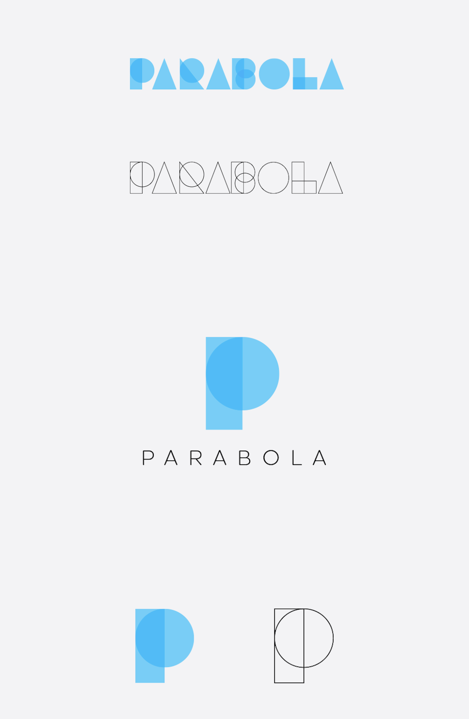
To counteract those drawbacks, designers are using a couple of techniques for making geometrics friendlier and more approachable in 2019. First, you can combine them with bright and warm colors, whose cheerfulness subverts the style’s inherent gloominess. Second, you can add more curves, which are more inviting and playful than straight lines and sharp corners. This way, your branding benefits from clean, modern lines, yet retains a positive, approachable vibe at the same time.

Logo design by bo_rad

Product packaging design by J U L I A M A R I E

Logo design by CostinLogopus

Logo design by enfanterrible
4. Vintage-inspired logos and packaging
—
Back to a more traditional trend, in 2019 we’ll see a resurgence in vintage branding, mainly through logo and packaging design.
While these approaches fall under “you know them when you see them,” we’ll outline a few basic guidelines to help you replicate each.
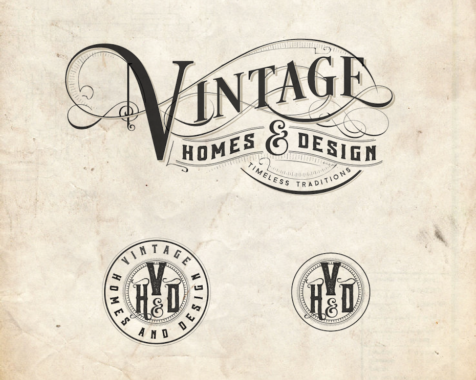
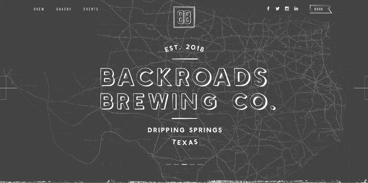
Vintage-inspired logos typically center around a main image, usually a hand-drawn illustration, often encased in an emblem-frame that includes the company’s name in a hand-lettered font and sometimes its slogan if there’s room. More often than not, vintage logos include an “established” year, even if it’s the current or last year. They also usually have a textured effect that makes the logo weathered, amplifying that sense of authenticity.
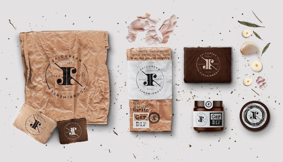
Vintage packaging follows many of the same stylistic choices, but it more open-ended since logos are more of a fixed format. You can tell vintage packaging by its use of muted, natural color palettes, an overall hand-made look and old-fashioned typography, especially writing the company name as a wave or on an upward slant.
Keep in mind that you can control how much or how little of the vintage look you use in your branding. If you don’t want to go “full retro,” you can pick and choose which elements to use. A common example is taking a modern logo and adding a weathered texture, or even just an established date. Learn more about mastering the vintage design trend here.

Product packaging design by Martis Lupus

Logo design by Footstep

Logo design by GOOSEBUMPS

Logo design by DSKY

Product packaging design by Steve Hai

Logo design by Sign²in
5. Intricate details
—
Serifs aren’t the only trend fighting against Big Brother minimalism. As a direct response, one branding trend that’s gaining traction lately is to embrace intricate decorative details—adding more embellishments and flourishes to give your brand designs more personality.
Drawing inspiration from baroque and art deco design styles, as well as the recent popularity of hand-drawn illustrations, this trend is typified by the same ornamental details that minimalists aim to strip away. In particular, some telltale characteristics include:
- line-shading
- repeated patterns of ornate, interlocking shapes
- subtle details (eyelashes, wrinkles, individual feathers, etc.)
- concentric and parallel lines
- visual flourishes to fill negative space
While this trend can produce some beautiful and artistic imagery for your brand, don’t forget the shapeshifting logos trend we mentioned earlier and make sure to also keep a pared down version on hand. Detailed visuals can be a big boost at times, but there will always be certain areas where you’ll need something simpler.


Product packaging design by Justswell

Logo design by merci dsgn

Logo design by Jani Tavanxhi

Logo design by thedani
6. Pixel art
—
Want to add something both futuristic and retro to your brand style? Try pixel art, which combines nostalgia for 80s video games with the forward-thinking style of digital art.
Pixel art, or 8-bit art, uses large, monochrome squares that resemble individual pixels and organizes them into recognizable shapes, whether a simplistic flower or an Italian plumber with a bushy moustache.
Diving in head-first, you can create visuals or mascots that look like they were pulled straight from an 80s arcade. Alternatively, you could dial it down for something more abstract and post-modern, using the pixels themselves rather than making them represent a bigger image.

Logo design by aarif ™

Logo design by Milusko

Logo design by CostinLogopus

Logo design by undrthespellofmars
7. Ghost letters
—
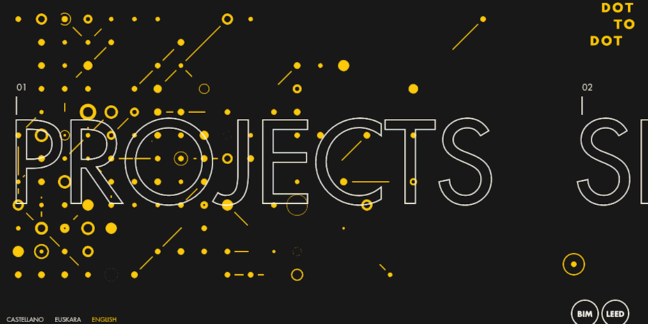
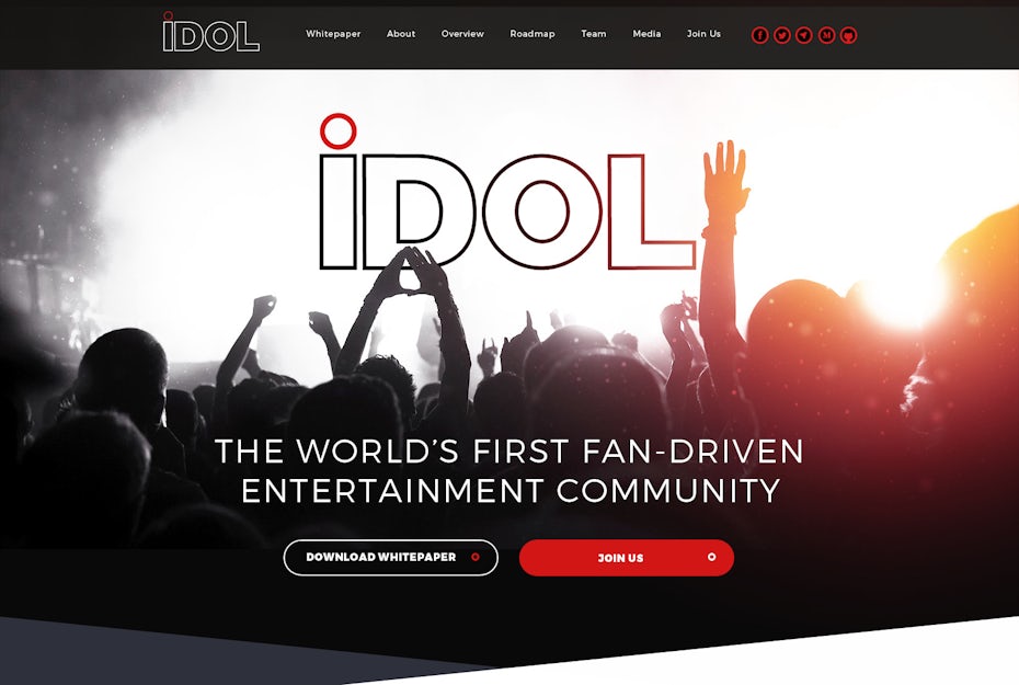
While typographic trends seem to follow their own set of rules, we’ve been watching the trend of ghost letters develop for some time now. The trend involves the outlines of letters with transparent insides, allowing you to see “through” them at the background image.
We first noticed its origins, the ghost button, that became popular alongside the hero image trend of the early-to-mid 2010s. Translucent buttons suit hero images since they obscure less of it. Then came the trend of big, bold typography of the last few years, a subgenre of the minimalist movement.
Combine them to get ghost letters—big and bulky typography that’s a bit more subtle and doesn’t take attention away from background images. This style benefits from large lettering and bold outlines that won’t impede readability, but like all flashy fonts they should only be used for titles and headings.

8. 3D imagery
—
As we’ve suggested throughout this list, technology has one of the biggest influences on branding trends. When one company unveils new, state-of-the-art visuals, people everywhere raise their standards a bit and start to expect that level of quality from all their favorite brands.

That’s what we see happening lately with 3D imagery. Some designers—in this case, artists is more fitting—have taken modern design software to its limits with impressive, photorealistic 3D imagery, blurring the lines between real-life and computer-generated visuals.
Coinciding with the decorative details trend above, 3D imagery using jaw-dropping visuals and an acute eye for details to create pictures whose goal is simply to “wow” onlookers. This trend works equally well for logos, backgrounds, and even lettering; when applied to branding, you can show potential customers just how cutting-edge and clever your brand is, all without saying a word.

Logo design by Diêgo Soou

Logo design by Katt Phatt™

Design by Pinch Studio

Logo design by **Faith**
9. Proactive negative space
—
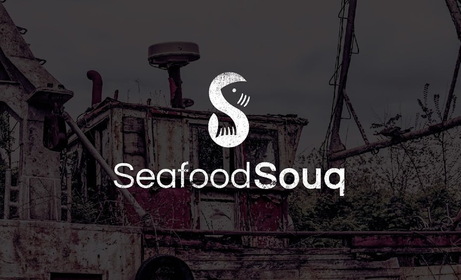
Not all trends are rooted in technology or reflexive of the state of society. Some trends are just whatever people like at the moment. That seems to be the case lately with how brands are using negative space in their logos—we’re seeing more and more designs incorporate negative space proactively in clever ways.
What we mean by “proactive negative space” is using empty space as part of your visual to communicate a hidden meaning or a clever message. Lately, designers have been taking negative space to the next level, using it to create memorable, creative designs.
This trend is perfect for adding duality and hidden levels to your branding strategy—it allows you to use two images instead of one. By turning negative space into an image, you make your textual logo more visually dynamic and avoid it looking boring.
10. Neo-minimalism
—
Despite the trends we mentioned that conflict with minimalism, the style itself—now more of a genre than a trend—is still alive and well within the design world. In fact, it’s even evolving in 2019 to reach new, unchartered territory.
We call it “neo-minimalism,” a subcategory of minimalism that’s a fresh take on the style for the new era. In many ways, neo-minimalism is an extension, or exaggeration, of the properties of minimalism: even less details, even more negative space, combined with flashy colors and bold typography, etc.
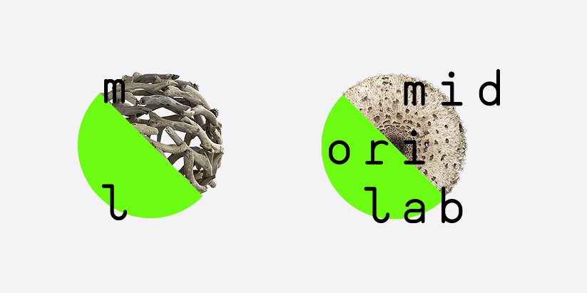
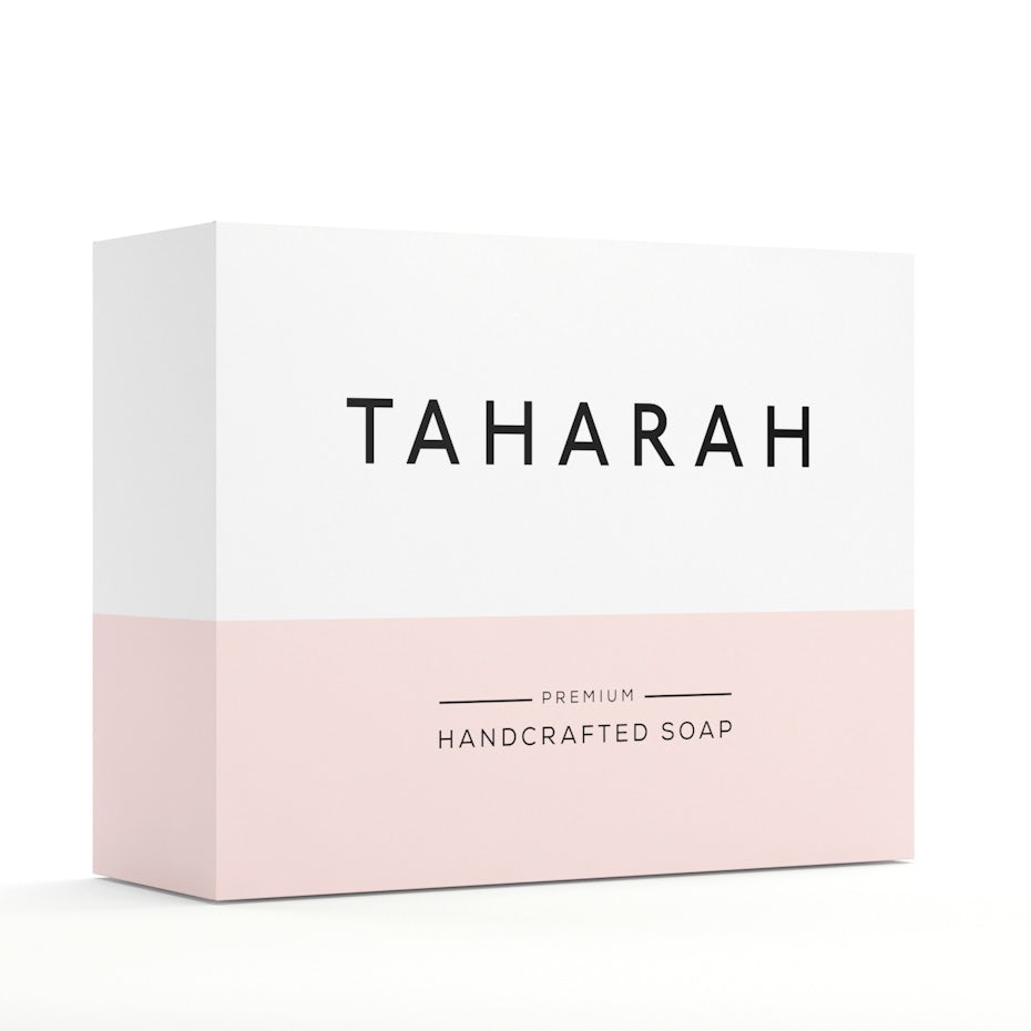
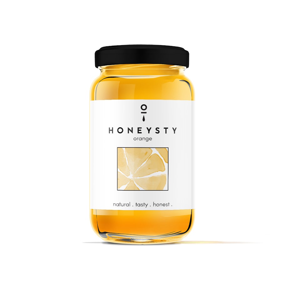
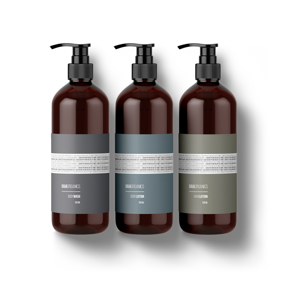
In neo-minimalist designs, it’s not uncommon to see entire web pages empty except for one or two words. Colors and fonts do all the talking. Logo designs can consist of nothing more than a couple lines or shapes, although they’re artfully laid out to create suggestive imagery. Even packaging design is embracing the trend, with largely empty wrappers filled with bold typography and/or some minimalistic imagery to tell more about the product inside.



Leave a Reply